Moss Arts Center Marketing Materials
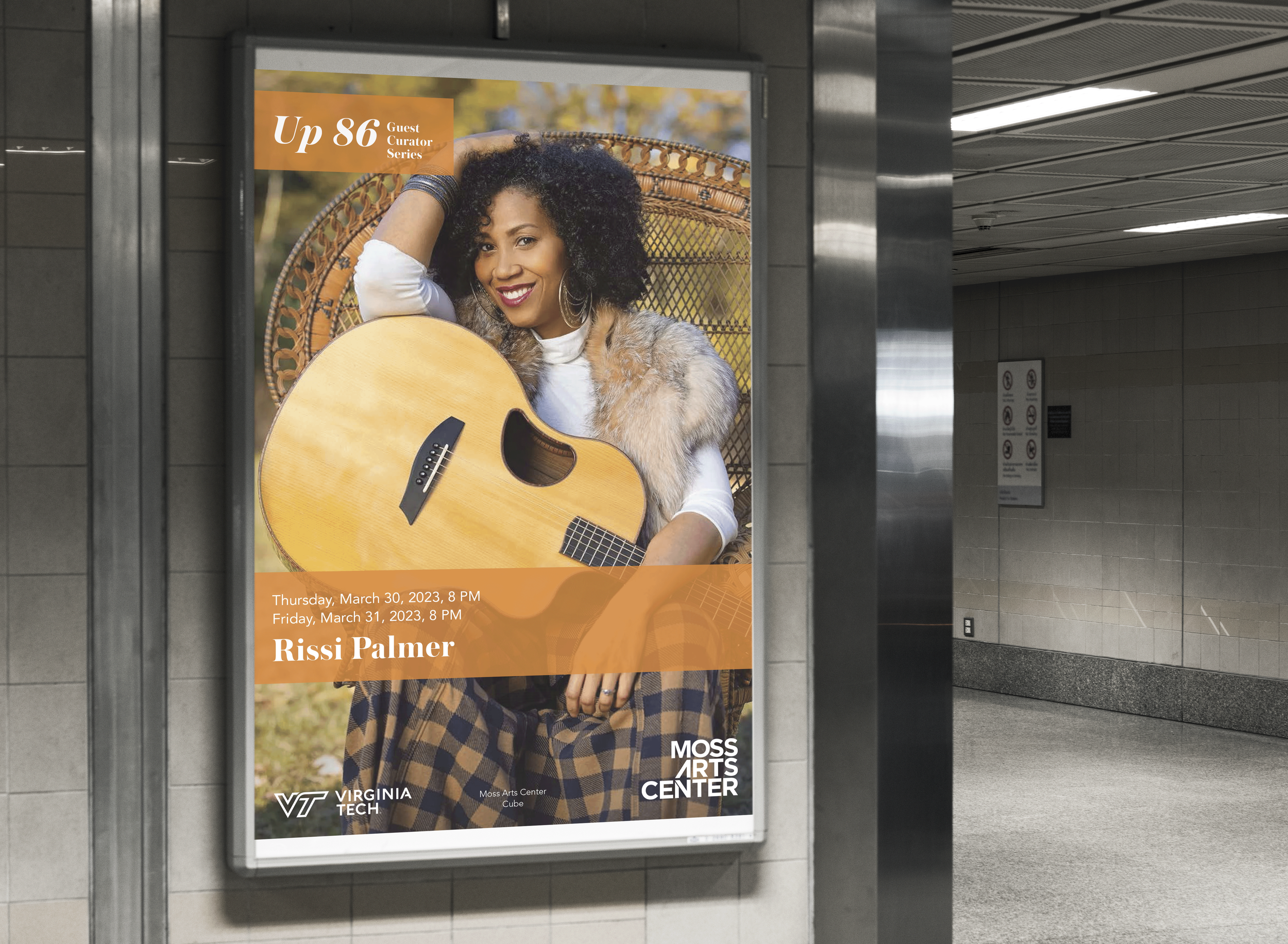
As an employee at the Moss Arts Center I have produced hundreds of materials for the company. With each season there is a new branding that we follow as a company, pictured below is the past two seasons branding, with the 2021-2022 season we utilized a “swoosh” and bright colors and followed strict font guidelines. The 2022-2023 season focused on interaction between text and images, color block styles, and incorporation of two fonts. During the internship I have produced programs, posters, digital and print magazine ads, door slides/tv slides, large scale ads/bus wraps, and social media campaigns.
Completed August 2021 - May 2023
Programs Used: Adobe Illustrator, Adobe Photoshop, Adobe InDesign, Adobe After Effects, Adobe Premiere Pro.

2021-2022 Season
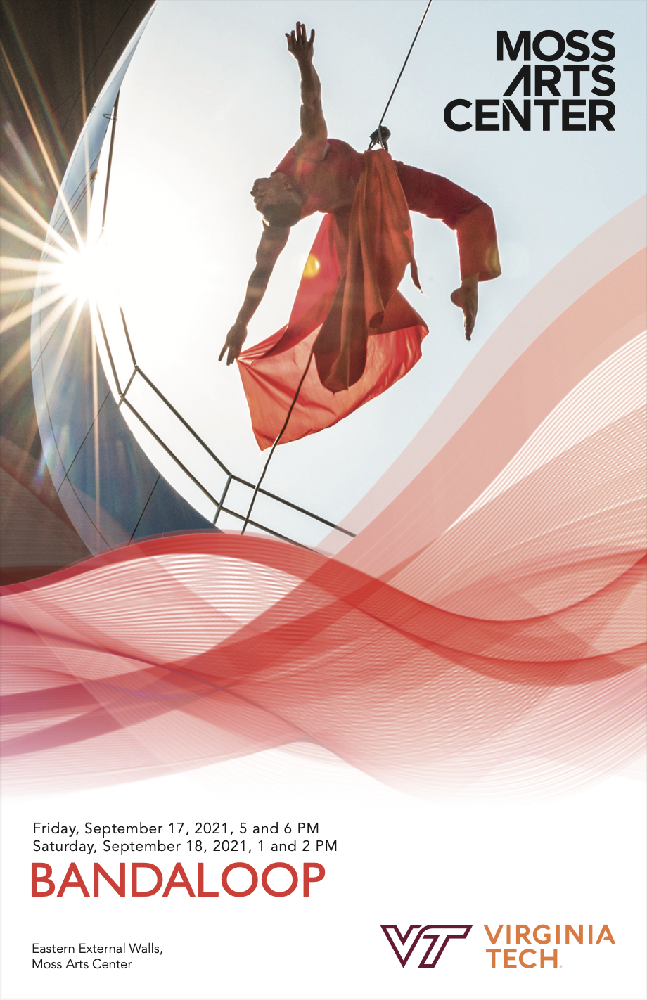
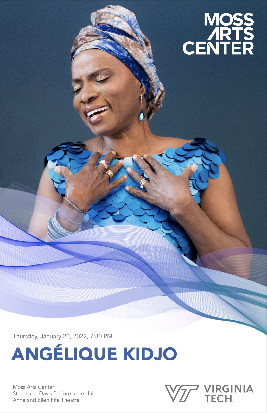
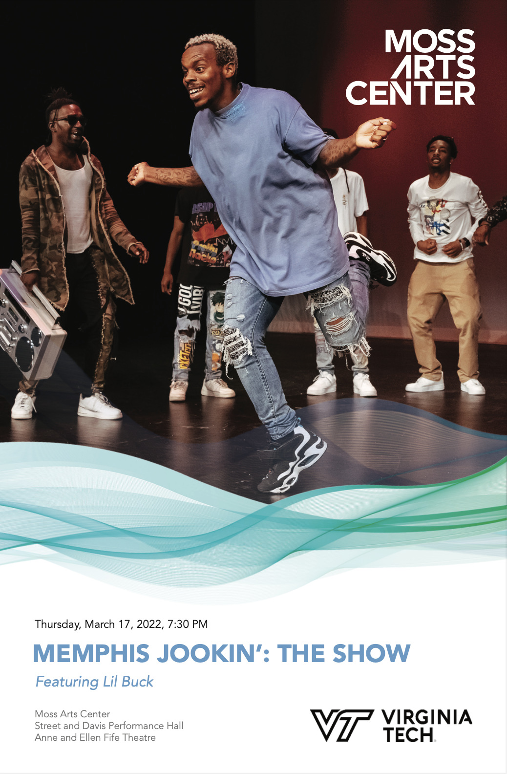
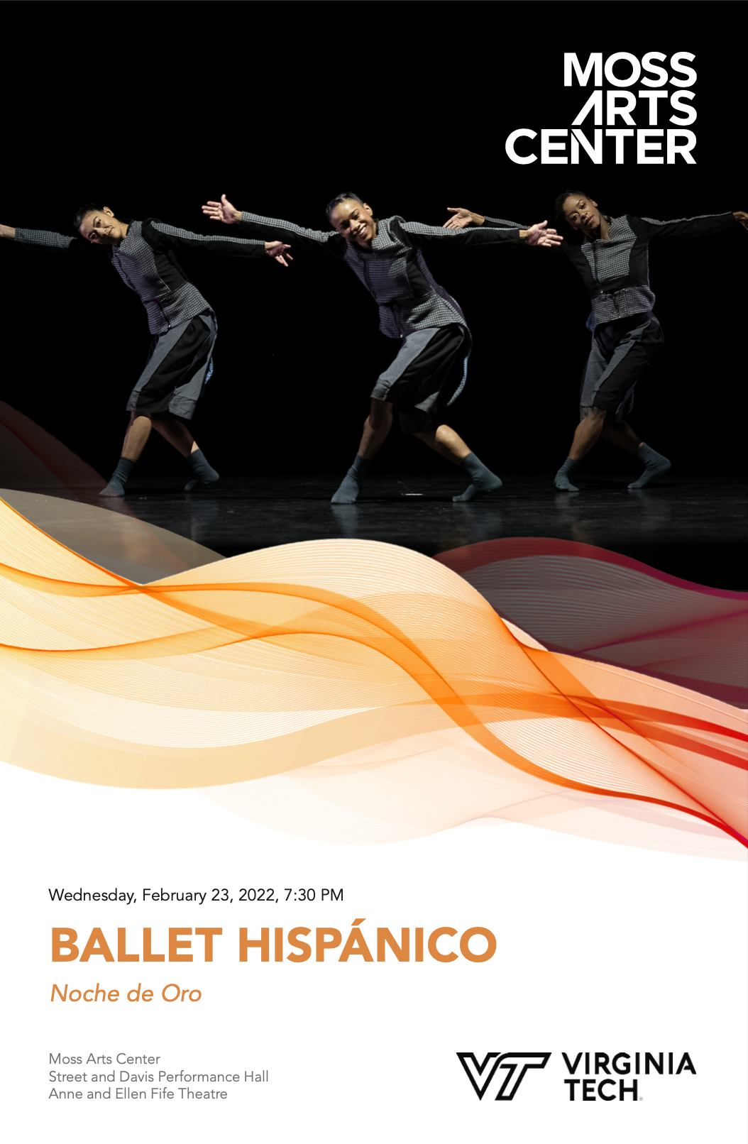
The 2021-2022 season utilized a “swoosh” design full of bright colors and followed strict guidelines. The team adhered to color pairings specific to each performance, this remained consistent for the entire season to ensure that the recognition and a brand identity were created not just for the Moss Arts Center company, but the individual performances as well.
Font used for all programs and advertising materials was Avenir. This font was selected as it is easy to read at very small sizes (programs and some printed materials used point sizes as small as 6pt for sub-captions and 8pt for body copy). Variations of the font family were used to create contrast between Avenir light and book (copy) and heavy and black (title). Oblique variations of the font were used in instances of quotes and titling.


Program Covers
__________________________________________________________________________________________________________________________________________________________
Digital Ads
1920 x 1080 | RGB | Not to Scale


970 x 250 | RGB | Not to Scale

320 x 73 | RGB | Not to Scale

300 x 250 | RGB | Not to Scale

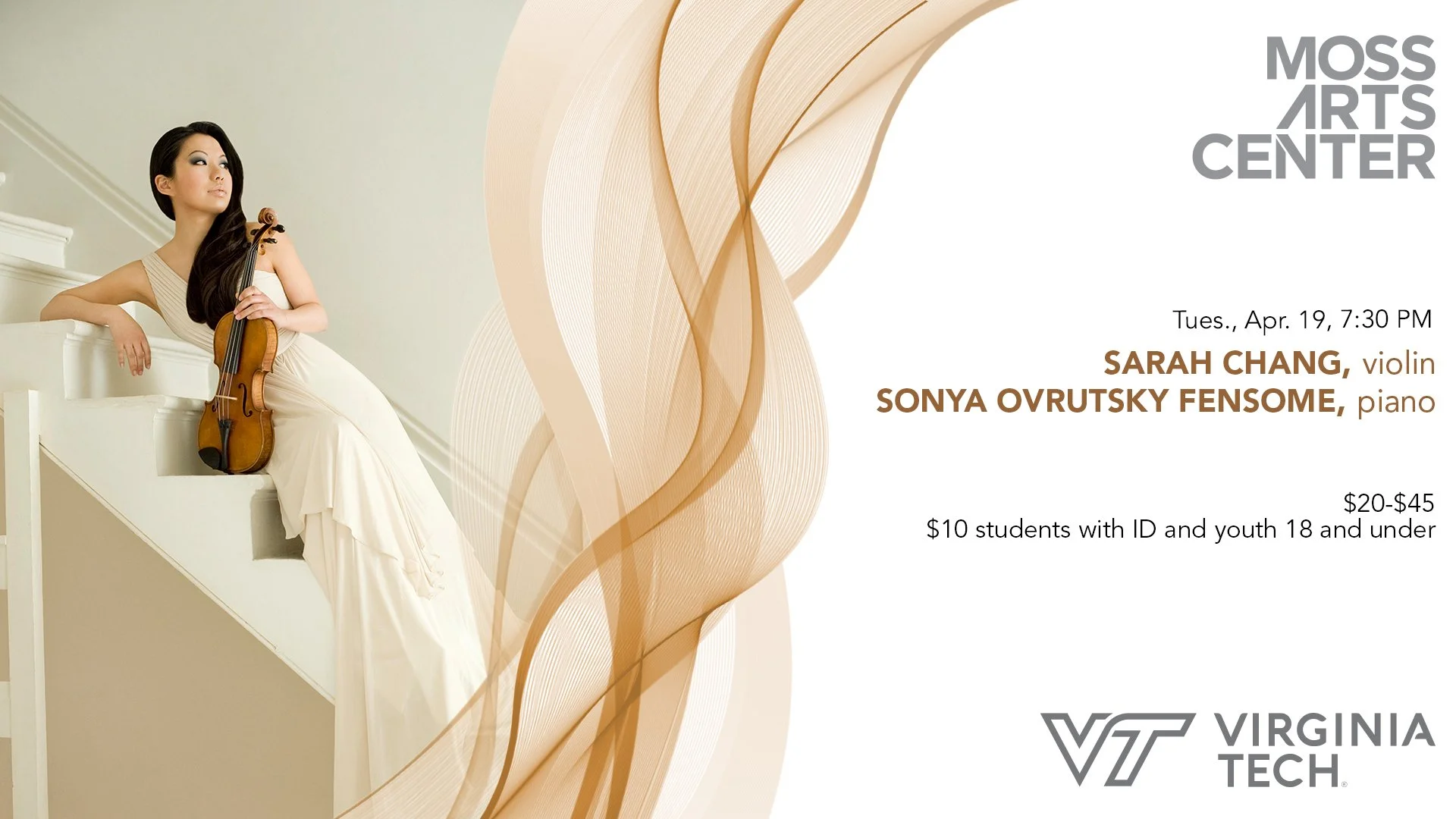
Digital advertising and marketing is a huge driver of success for the Moss Arts Center. Ads can be displayed anywhere from local newspapers on digital runs, to student focused email chains that Virginia Tech promotes.
All ads for the 2021-2022 season followed a consistent design scheme and branding. To maintain uniformity between performances, all titles used Avenir Black, with dates in Avenir Book. Subtitles and specialities were designed in Avenir Roman or Avenir Oblique.
For visual appeal, all titles and subtitles were color matched to the swoosh on the ad, and to create distinction between ticketing info and performance titles black was used to detail date and time as well as ticket pricing.
The Moss Arts Center logo has a right alignment with left rag, therefore, for most ads the logo Is placed on the right side to maintain a cleaner aesthetic. In special circumstances, when images were difficult to place with the swoosh, the logo was moved to the left side, but this was not standard in the branding.
Although the Virginia Tech logo has a left alignment with a right rag, it is often seen on the right hand side, as priority was given to keeping it on the same side of the ad as the Moss Arts Center logo.
For both the Moss Arts Center and Virginia Tech logo, color was dependent on visibility and interaction with the colors and space on the ads. On smaller ads, black logos are preferred, as they offer more contrast and better visibility at smaller sizes. The grey ad was preferred on larger format ads, as it could be read easily and didn’t take away from the imagery and design on the ads.
__________________________________________________________________________________________________________________________________________________________
Work in Context
The materials I produced for the Moss Arts Center during the 2021-2022 season ranged from small scale digital ads, to large format bus wraps. These materials reached audiences of the 30,000 students at Virginia Tech, as well as the local community of Blacksburg and the New River Valley. The target audience ranged from ages 5-60+ and therefore needed to be digestible by all communities.


2022-2023 Season
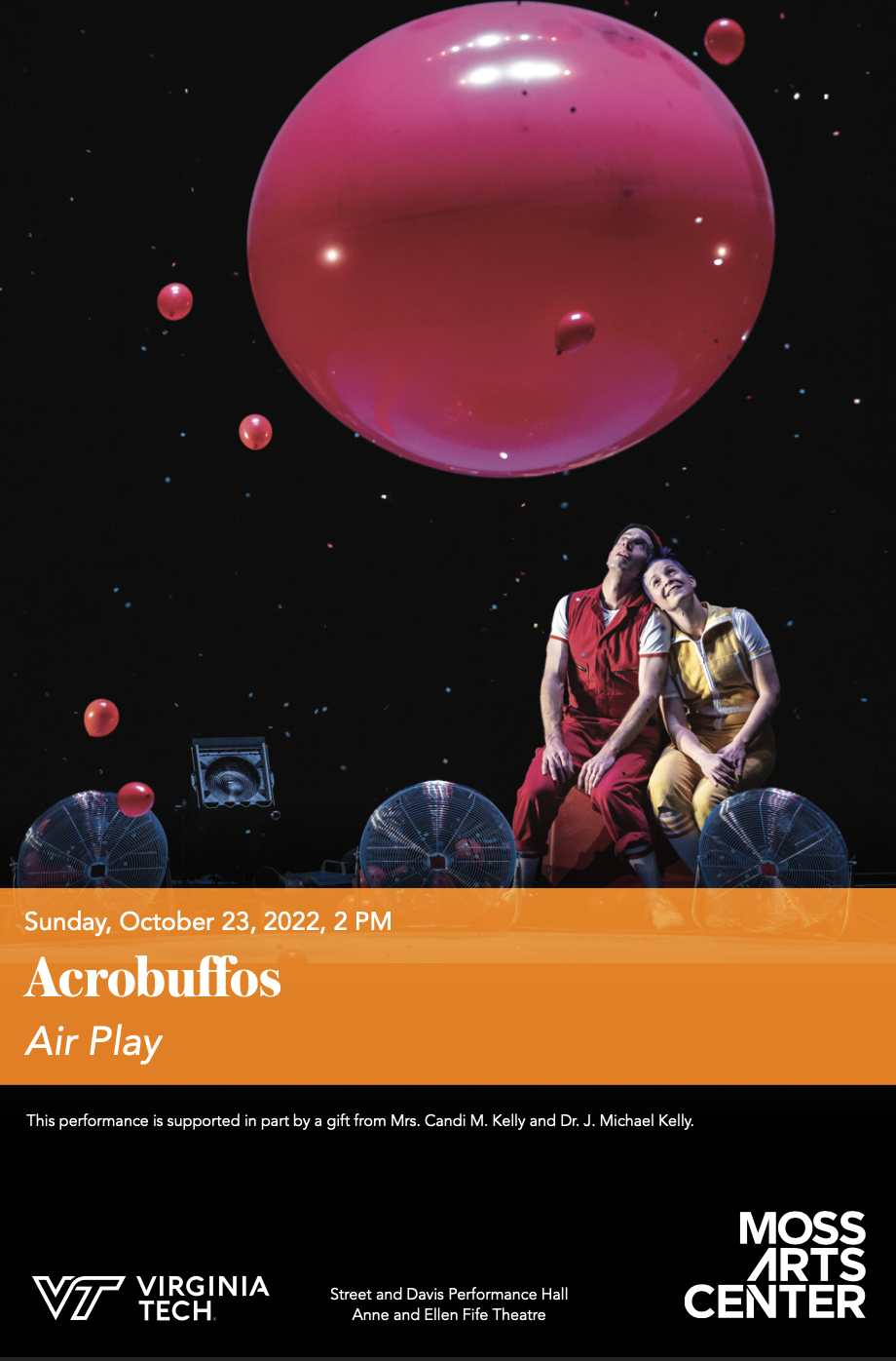
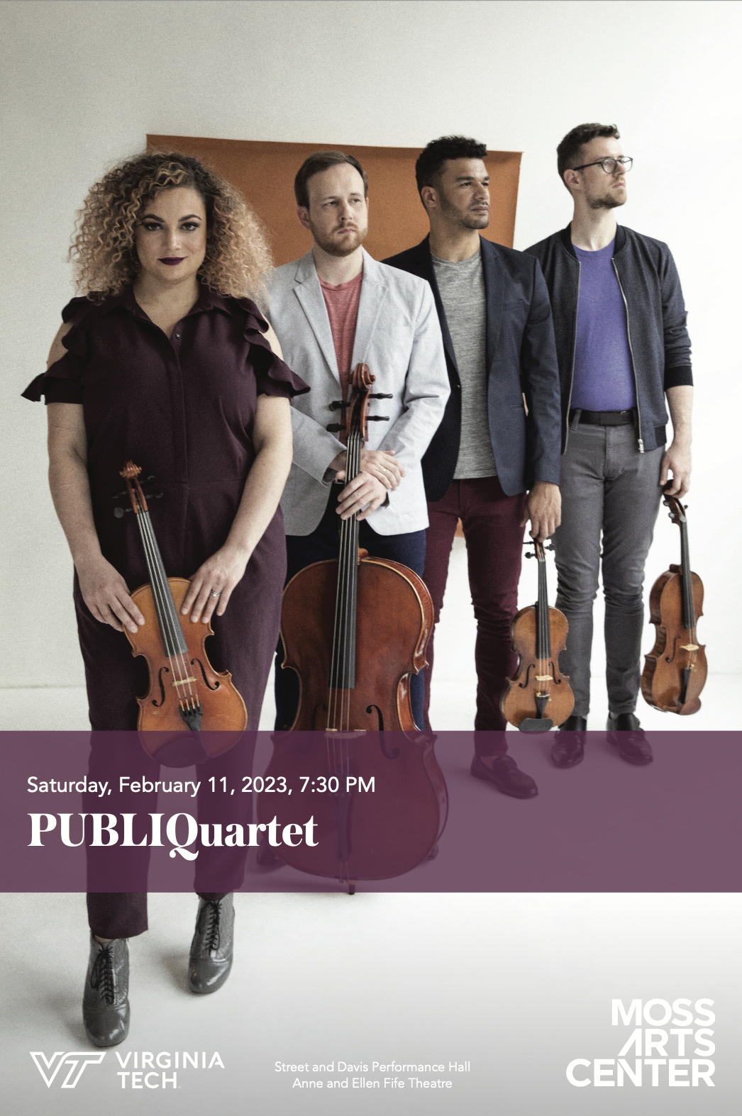
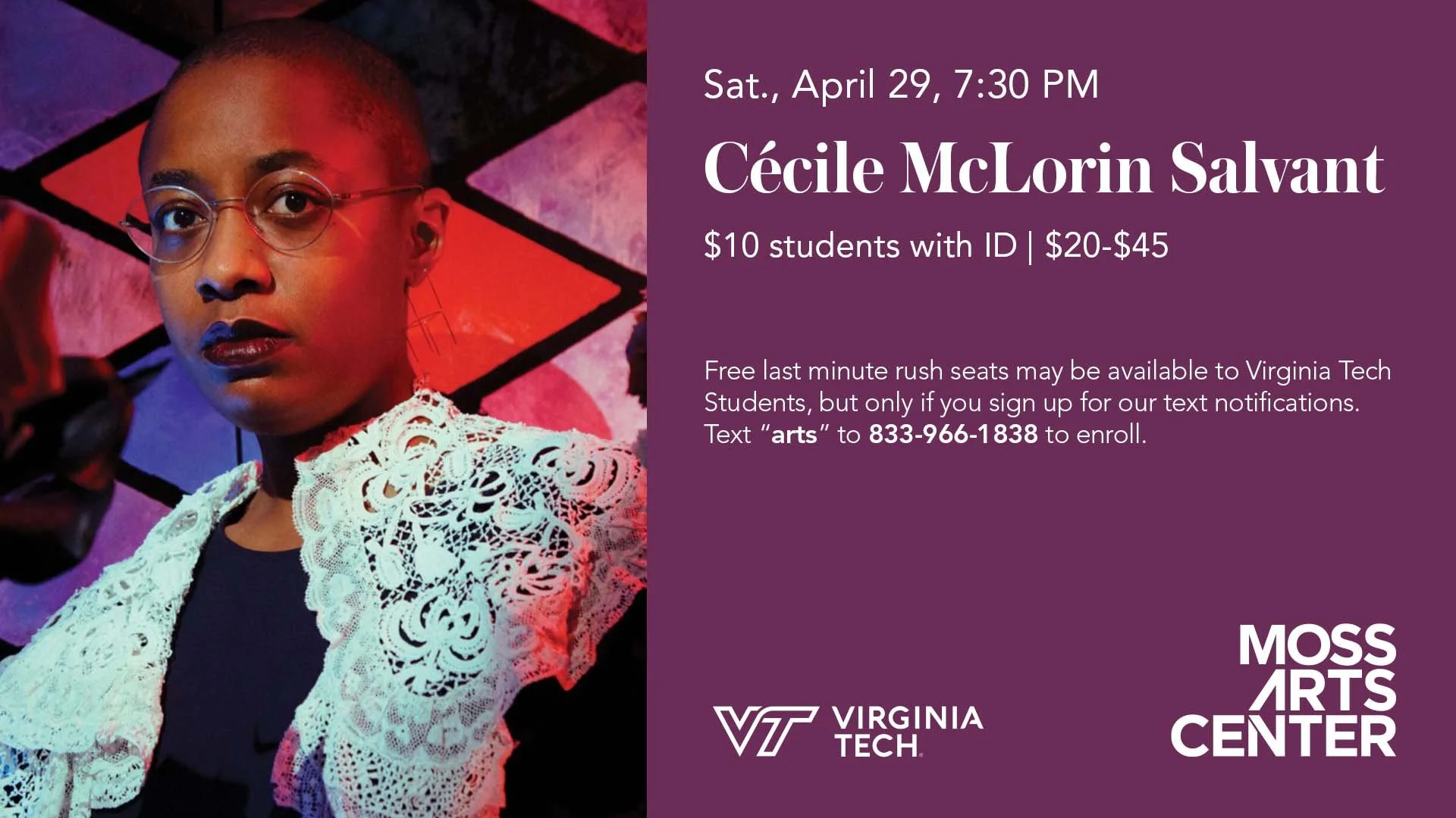
The 2022-2023 season utilized a mix of transparent and opaque rectangle banners, designed to complement the adjoining fonts of Austin and Avenir, the entire 22-23 season followed strict guidelines. The team adhered to color pairings specific to each performance, this remained consistent for the entire season to ensure that the recognition and a brand identity were created not just for the Moss Arts Center company, but the individual performances as well.
Fonts used for all programs, posters, and advertising materials were Avenir and Austin. These fonts were selected as they are easy to read at very small sizes (programs and some printed materials used point sizes as small as 6pt for sub-captions and 8pt for body copy). Variations of both font families were used to create contrast between Avenir and Austin Text. Oblique variations of the font were used in instances of quotes and titling.


18 x 24 Poster Designs


__________________________________________________________________________________________________________________________________________________________
Digital Ads
1920 x 1080 | RGB | Not to Scale
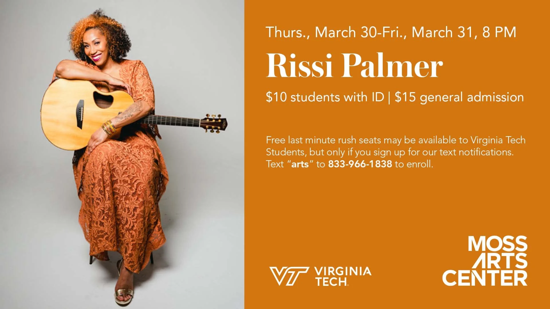

1920 x 1080 | RGB | Not to Scale

320 x 90 | RGB | Not to Scale

300 x 250 | RGB | Not to Scale

Digital advertising and marketing is a huge driver of success for the Moss Arts Center. Ads can be displayed anywhere from local newspapers on digital runs, to student focused email chains that Virginia Tech promotes.
All ads for the 2022-2023 season followed a consistent design scheme and branding. To maintain uniformity between performances, all titles used Austin Cyr (variable weights) with dates in Avenir Book. Subtitles and specialities were designed in Avenir Roman or Avenir Oblique.
For visual appeal, all titles and subtitles were color matched to the color block on the ad; and to create distinction between ticketing info and performance titles black or white was typically used to detail date and time as well as ticket pricing.
The Moss Arts Center logo has a right alignment with left rag, therefore, for most ads the logo Is placed on the right side to maintain a cleaner aesthetic. In special circumstances the logo was moved to the left side, but this was not standard in the branding.
Due to the fact the Virginia Tech logo has a left alignment with a right rag, it is often seen on the left hand side.
For both the Moss Arts Center and Virginia Tech logo, color was dependent on visibility and interaction with the colors and space on the ads. On smaller ads, black logos are preferred, as they offer more contrast and better visibility at smaller sizes. The grey ad was preferred on larger format ads, as it could be read easily and didn’t take away from the imagery and design on the ads.
1080 x 1920 | RGB | Not to Scale

720 x 1440 | RGB | Not to Scale

1080 x 1920 | RGB | Not to Scale
Work in Context
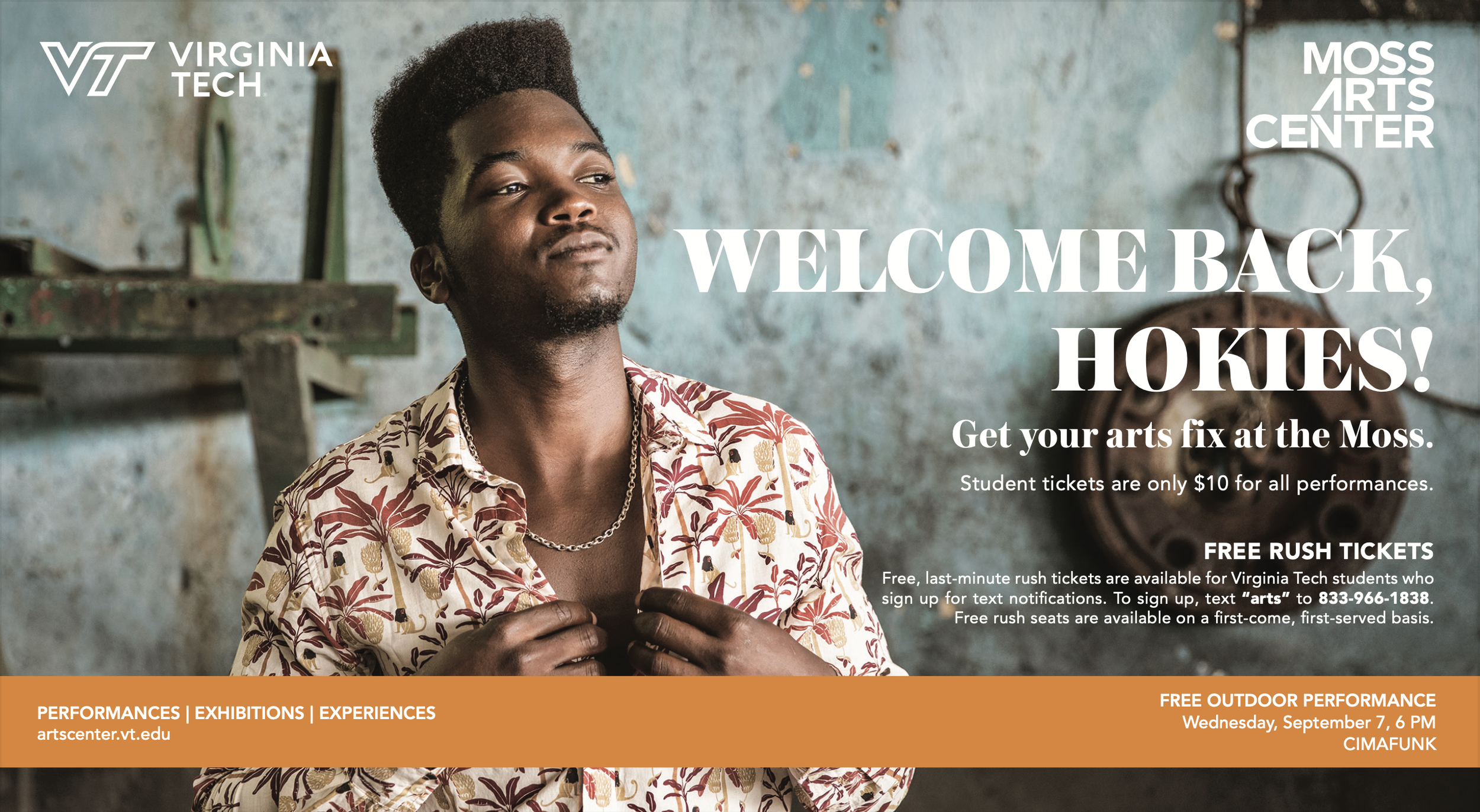
The materials I produced for the Moss Arts Center during the 2022-2023 season ranged from small scale digital ads, to large format print posters. These materials reached audiences of over 30,000 students at Virginia Tech, as well as the local community of Blacksburg and the New River Valley. The target audience ranged from ages 5-60+ and therefore needed to be digestible by all communities.
