
Our Daily Bread Rebrand
The goal of this project was to analyze and research a current logo from a brand/business in Blacksburg, VA. After considering market competition and brand identity a new logo for the company was created. The goal of the new logo is to focus on the brand characteristics and embody that within the logo.
Completed in October 2022
Programs Used: Adobe Illustrator, Adobe Photoshop

Logo Comparison and Monotone Testing
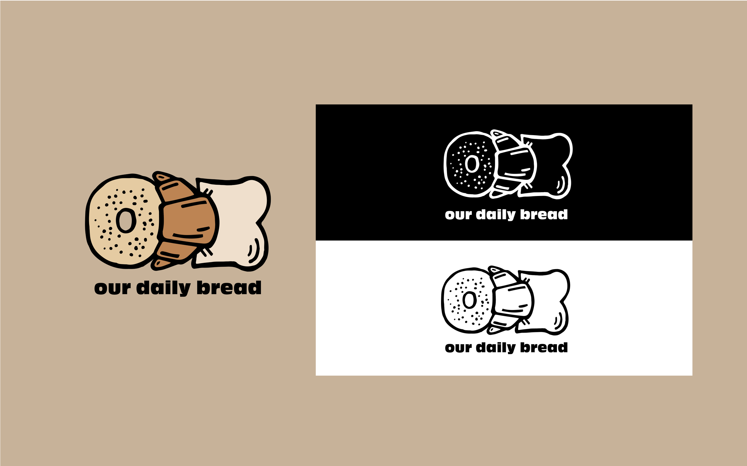
The new logo for Our Daily Bread draws from imagery and design elements of the original logo, while maintaining a fresh and creative new take on the personality of the business, aiming to reflect the close-knit mom and pop type shop vibe. By removing the full caps design and adding all lowercase, the logo becomes friendlier and warmer to the customer.
The black and white monotone testing shows that the logo will work in full color as well as in both black and white iterations. This is important to identify as the business may use their logo on printed ads and papers, as well as reciepts and it must stay legible in all color variations
Original Logo
__________________________________________________________________


__________________________________________________________________


Brand Expansion | Patterning and Designs for Merch/Apparel
The new logo design is easy to implement as a standalone design as well as duplicated to create a pattern.
Additional Logos
The logos below are an exploration of different logo variations that could be used by the company to promote special events and seasonal items. Although the main logo features a poppyseed/everything bagel, it could be plain, pumpernickel, marbled rye, and so on. This ability to change the logo allows for continual excitement and ensures that the logo does not date as quickly. Additionally, the ability to change aspects of the logo and still maintain the original identity shows that the logo is dynamic and thought out for expansion purposes.


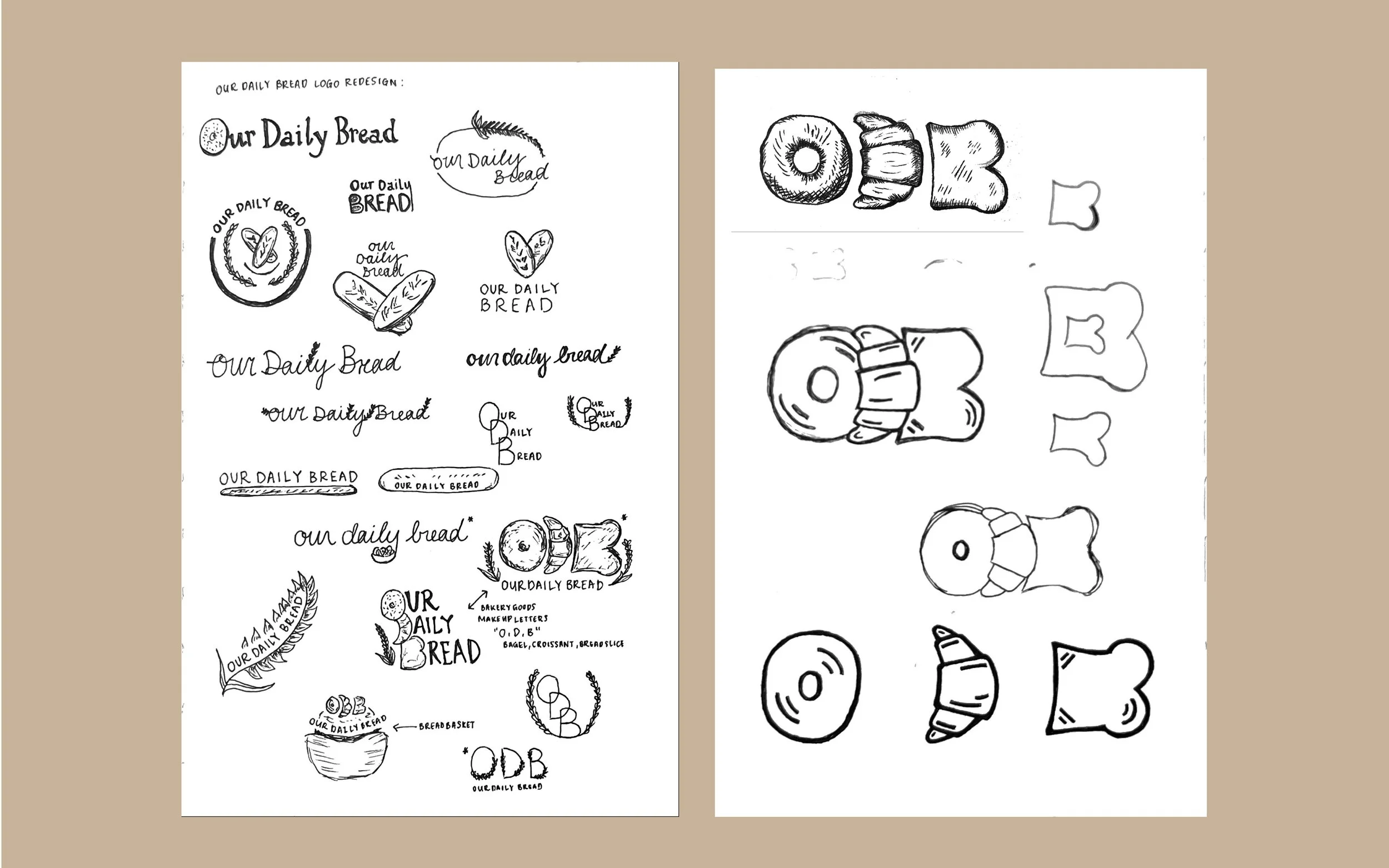
Sketching and Idea Generation
While developing sketches for Our Daily Bread’s logo redesign, I wanted to consider preexisting brand identity, legibility, as well as brand representation. The original logo was legible and identified that the business was a bakery, but lacked the same charisma that the interior of the bakery displayed.
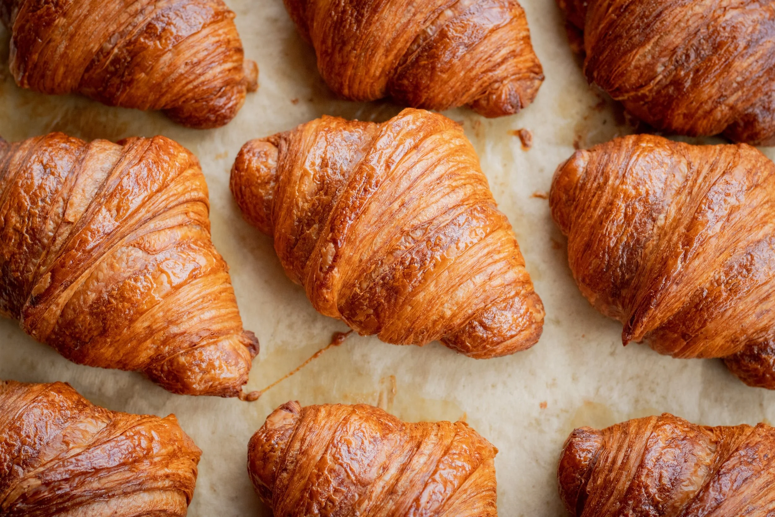
Through iterations I developed sketches that resembled the old logo, focusing on the french baguette and wheat emblems, however, as I continued to push the designs further I began to incorporate more items that they sell in store. While reading through their menu and visiting the shop, I gathered that their most successful products were: bread loaves, individually sliced breads, muffins/cupcakes, bagels/donuts, and croissants.
Thinking about the most popular items, I started to think about the natural letter forms they create. A bagel being an O, a croissant resembling a D, and a slice of bread forming a B. Once I discovered these connections I developed some rough sketches based on those letter forms. I had to balance the legibility of the letters along with the illusion of the actual products.
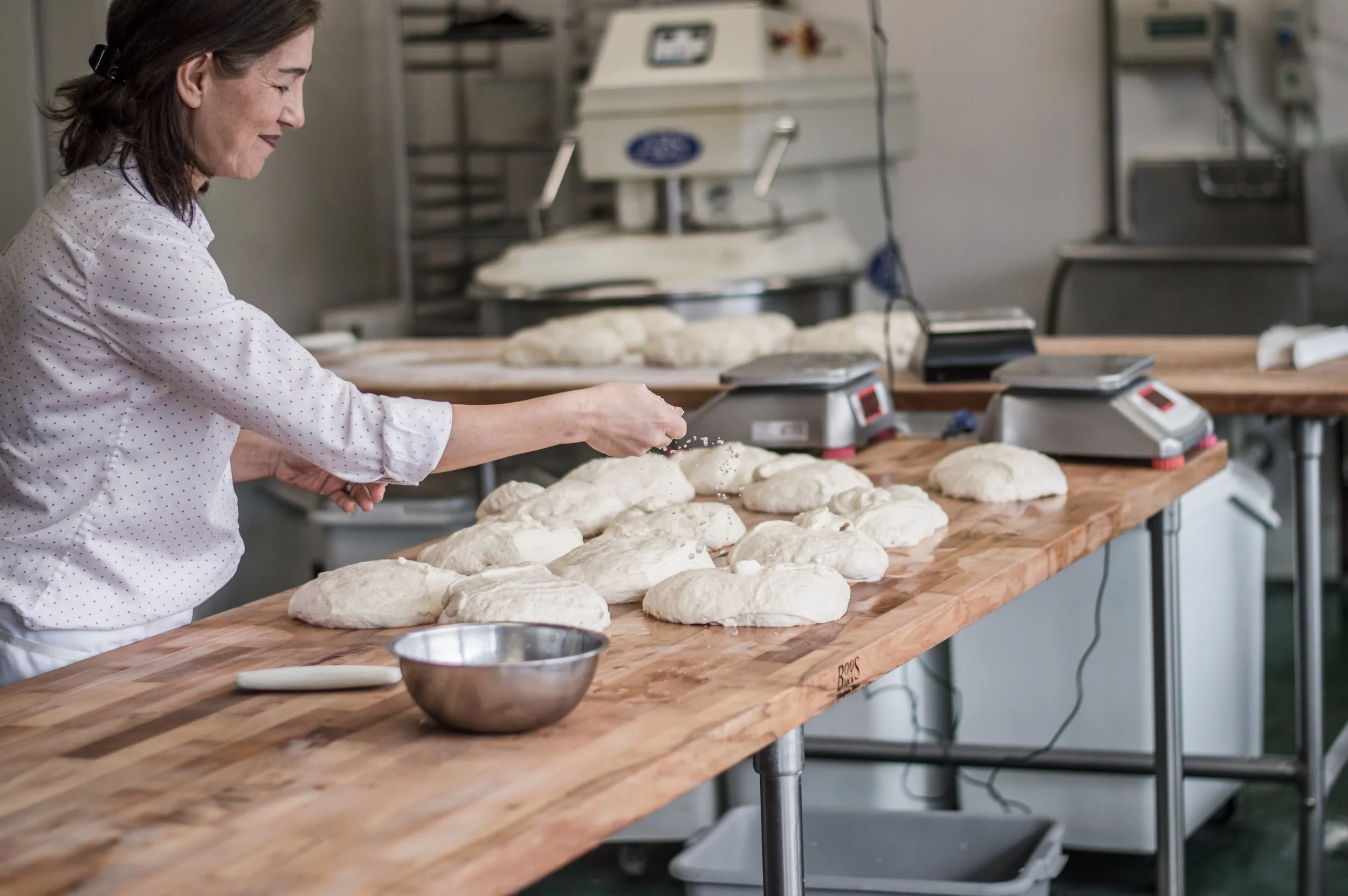
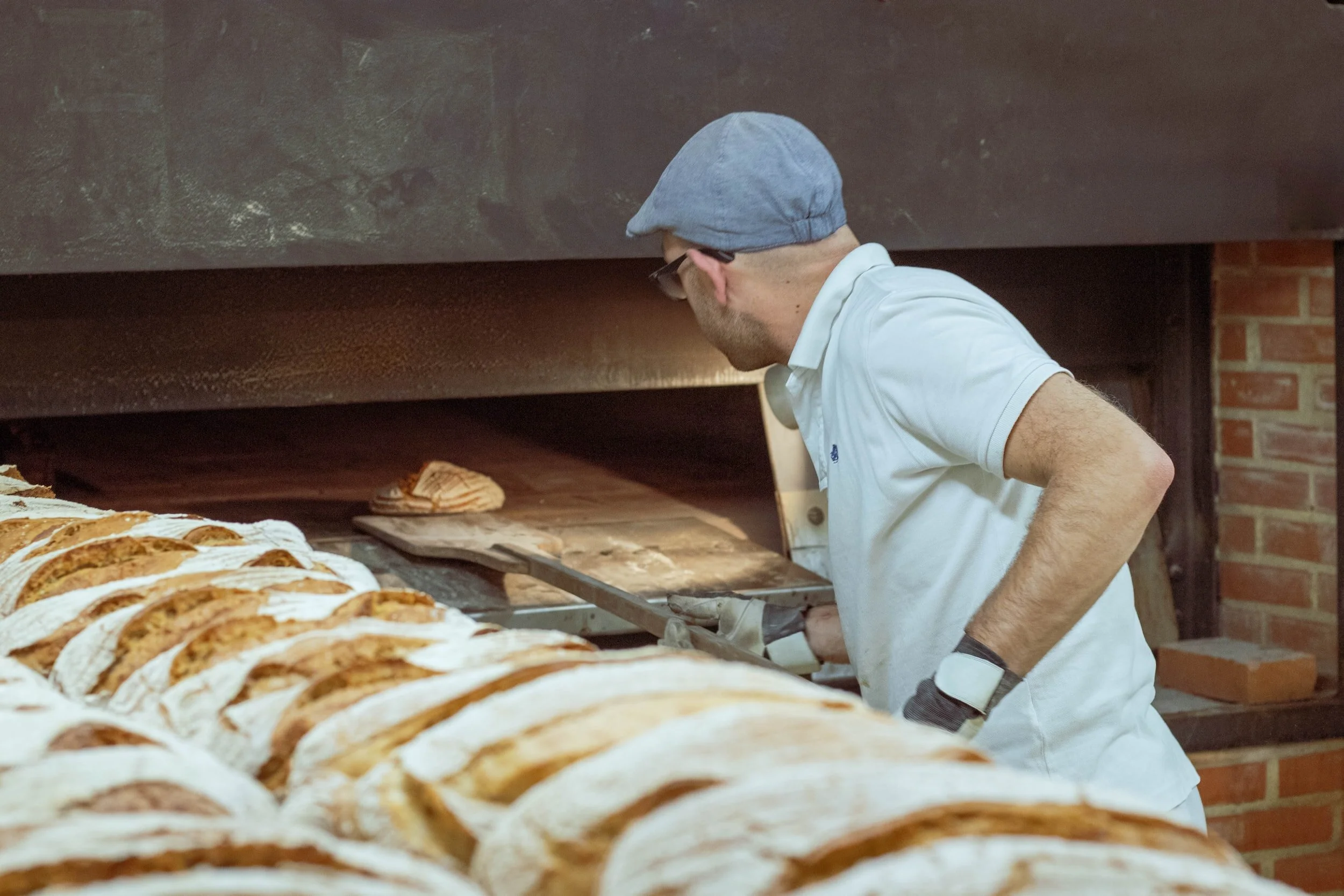
About the Company
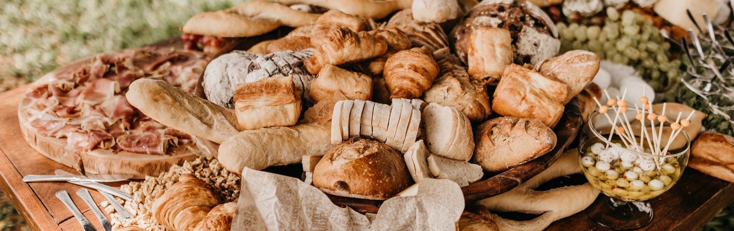
Our Daily Bread Bakery & Bistro, established in 1980, has steadily grown from a small bakery into a bustling patisserie, bistro, and caterer. They serve breakfast, lunch, and dinner as well as a variety of pastries, cakes, pies and breads.
They are passionate about the art of baking and hospitality. Fresh hot breakfast items and pastries can be enjoyed with organic gourmet coffee or Italian espresso drinks. Lunch is made fresh daily featuring sandwiches made from fresh baked bread, whole grain salads, made-from-scratch soups and special-of-the-day entree items. For dinner they specialize in French-inspired cuisine.
Mockups, Brand Expansion, and Additional Logos
Mockups, brand expansion, and additional logos are all important considerations to take when designing a new logo for a company. The new design should be able to be integrated into packaging, merch and assets for the company. It is important to show the client these potential uses of the logo to let them have an understanding of the versatility of the logo.
Mockups
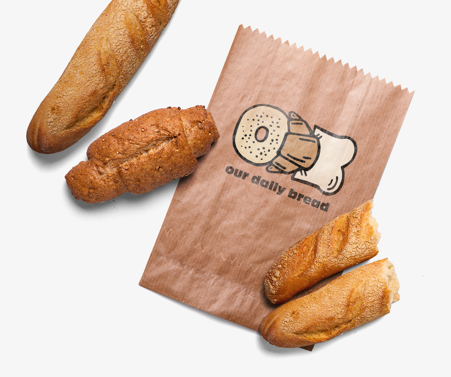
Seeing and envisioning the logo on different materials is an integral part of selecting and confirming new branding. With the mockups I selected, I wanted to showcase the impact a logo can have on packaging and materials. I additionally chose to mock up items specific to the company, such as bread bags, mugs, receipts and aprons. This allows the company to see their new branding in action and in a recognizable form.


__________________________________________________________________
Logo Callouts
While developing the new Our Daily Bread logo I wanted to focus on embodying the charisma and quirkiness of the bistro. To do so I began experimenting with different styles of line/stroke to determine which option gave the most natural and authentic feel. After deciding on a stroke that had both thicks and thins, I decided it was the direction I wanted to push. Therefore, the entire logo is comprised of variable stroke weights, and no one is consistent or perfect, just like the products the bistro makes daily. The text pairing was another intentional use of thick/thin contrast, and I wanted to make sure it had a playful character while maintaining legibility as well as its own ability to stand alone from the logo mark. To add more depth to the logo I added small details such as seeds and lines to give more dimension to the baked goods used in O D B.
______________
Style Guide
The style guide for the new logo is critical to the client as they need to understand which color schemes have been chosen for the logo. This will help the client when purchasing merch, creating apparel, and additional advertisements in the future. I also included the fonts used in case the client needed them for packaging and advertising materials in the future.
The color scheme for the new logo is designed to emulate the coziness and comfort of the bistro, while also alluding to the colors that occur within products seen at the bistro. The background color is a suggested palette to use with all three primary logo colors, and works well with all three without distracting from the logo. If the client continues to use colors from the palette then their designs will stay consistent and will maintain a strong brand identity across all materials.